Bureau of Labor Statistics Data with Minor Data Munging
This foray into the somewhat recent history of unemployment rates (UR) will be a quick read. Before we even start trying to reason with what the data is telling us at first glance. We need to know everything we can about the data. What can the data at hand tell us? Are appearances deceiving (think UR percentages and the time series rises and falls)?
There are two lines on all of these charts. Those are there for a reason. If we segregated all the factors and used a wider array of seriesID data from BLS, we might expect to see at least half a dozen time series lines. Instead we’ll focus of the two groups, the unemployed and those marginally attached to the workforce. A better term for this last group is underutilized and I will use this going forward.
Getting the big picture
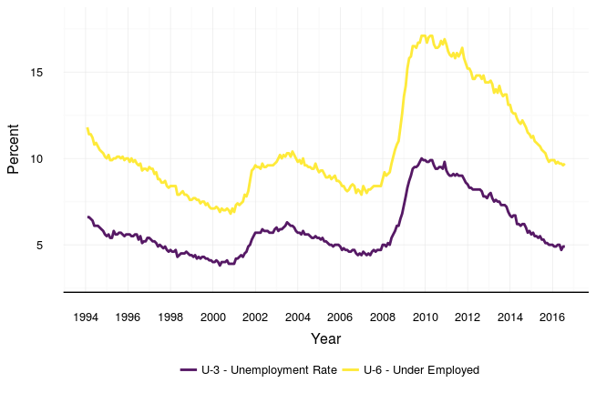
US Unemployed and Underutilized Rates: 1994-2016
Below is another time series plot showing the big picture changes in the unemployed and underutilized rates for the last 22-23 years. We can see the peaks and valleys clearly with all the years together in one chart, but we still have more exploring to do.
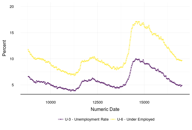
I converted the date format to its internal numeric form so that I can use it in quantitative analysis in the near future. The plot below shows the linear slope for the dates (date format) and the new date.num variable (numeric). It shows they match. The data conversion is good.

Converting the data also allows for more plot visualization options. The plot below looks a lot like the time series plot for the Clinton years (1993-2000).
Conclusion
Followup posts that use the BLS data will include descriptive and inferential statistical analysis.
Supplemental Materials
Below is the code I used for the post. I omitted intermediary steps that may be self-evident. If you are new to R and don’t understand how I got something to work, please comment below.
Step 1
Load the blscrapeR library and call in data. Next, I merged the datasets into a new one called “bls_full” for years 1994-2016.
library(blscrapeR)
bls_94_2000 <- bls_api(c("LNS13327709", "LNS14000000"),
                       startyear = 1994, endyear = 2000)
bls_2008 <- bls_api(c("LNS13327709", "LNS14000000"),
                    startyear = 2001, endyear = 2008)
bls_2016 <- bls_api(c("LNS13327709", "LNS14000000"),
                    startyear = 2009, endyear = 2016)

bls_full <- rbind(bls_94_2000, bls_2008, bls_2016)
Plot 1
Plot a time series plot for all the years in the combined dataframe we made above (bls_full).
library(ggplot2)
gUE_full <-
ggplot(data=bls_full, aes(x = date, y = value, color=seriesID)) +
  coord_cartesian(ylim=c(3, 18)) +
  geom_line(size=1, alpha=0.9) +
  scale_color_viridis(discrete=TRUE,
                      labels=c("U-3 - Unemployment Rate",
                               "U-6 - Under Employed")) +
  scale_x_date(date_breaks = ("2 year"), date_labels = "%Y") +
  xlab("Year") +
  ylab("Percent")
Convert Date Variables for Analysis.
Use appropriately and don’t use the dates this way when the date belongs to a discrete category like financial quarters, seasons, etc.
Convert the date formats and write the new numeric value to a new variable.
bls_full$date.num = as.numeric(bls_full$date)Plot 2
Check the linear relationship between the date and date.num data.
data = bls_94_2000
plot(date ~ date.num, data=bls_94_2000, ylab = "Date", xlab = "Numeric Date")
Use a new plot to check that the previous time series plots match up with the date.num representation.
Plot 3 - Checking Numeric Date and UE/UU Rates
ggplot(data=bls_full, aes(x = date.num, y = value, color=(seriesID))) +
  coord_cartesian(ylim=c(4, 20)) +
  geom_line(size=1.5, alpha=0.30) +
  geom_point(size=0.3, alpha=0.90) +
  scale_color_viridis(discrete=TRUE,
                      labels=c("U-3 - Unemployment Rate",
                               "U-6 - Under Employed")) +
  xlab("Numeric Date") +
  ylab("Percent")
Recent Posts
-

An Introduction to Using Google BigQuery in R
Posted on 28 Jan 2017 -
Mapping Electoral Votes and Unemployment in the US
Posted on 13 Nov 2016 -
Bureau of Labor Statistics Data with Minor Data Munging
Posted on 26 Aug 2016 -
Bureau of Labor Statistics Data with blscrapeR: US Unemployment
Posted on 23 Aug 2016