Bureau of Labor Statistics Data with blscrapeR: US Unemployment
The Bureau of Labor Statistics (BLS) has made good on the Open Data Initiative aims of providing open access to government datasets. Fortunately there is an R language api for the BLS data called “blsscrape”, which I found first on Jason Rickert’s article on R Packages for Data Access at the Revolutions blog. This example uses BLS data for the U-3 (unemployment) and U-6 (marginally employed) datasets for series numbers LNS14000000 and LNS13327709 respectively. The years selected range from 1994 to 2016 and are grouped by the last three US president’s terms of office.
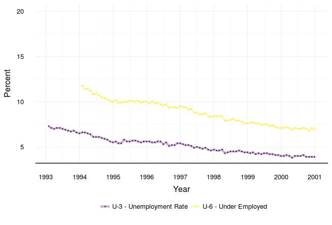
Unfortunately, access to the BLS data is not uniform for all series and categories. The data for the LNS13327709 series (all marginally attached workers) only goes back to 1994. In the first plot below, the marginal series starts at 1994; the unemployed group’s unemployment rate (UR) starts at 1993.
The Bill Clinton years: 1993-2000
US Unemployement and Underutilization
The plot below shows a time series plot of unemployment (lower line) and the full marginally unemployed data (upper). The BLS data for “marginally attached to the workforce” is defined as “Persons not in the labor force who want and are available for work, and who have looked for a job sometime in the prior 12 months (or since the end of their last job if they held one within the past 12 months), but were not counted as unemployed because they had not searched for work in the 4 weeks preceding the survey” http://www.bls.gov/bls/glossary.htm. Workers working part time for economic reasons and other discouraged workers are a subset of the marginal workforce.
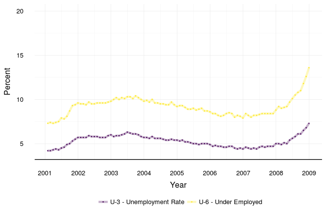
The George W. Bush years: 2001-2008
US Unemployement and Underutilization
This plot provides a quick way to show large and rapid deviations. Moreso, the small rise in the UR ending in 2002 and then the much larger rise throuought 2008 are well known. The first of these periods is associated with the dot-com bubble burst and aftermath of 9/11; the second is well known as the beginning of the great recession.
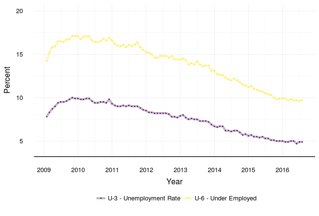
The Barack Obama years: 2009-2016
US Unemployement and Underutilization Obama is elected at the beginning of the great recession. The UR continues to rise until 2010 and then begins a long decrease with a couple of uptick perturbations at the end of 2011, beginning of 2013, and with the overall marginal rate at the end of 2012.
Conclusion
The aims of this first post were simply to introduce a source of open data (BLS) and a tool for extracting that data (blscrapeR). Introducing sources of open access data and tools for using are the overall aims for this site. Grokking all of that occurs after we have insights from a full analysis of relationships in the data. That will come later in this series on BLS data and US unemployment since 1993.
Supplemental Materials
Here is where in all future posts you will find a review of the coding steps used to produce the data. I decided to seperate the main overview and results from the code for now so that the data could be the star and the steps getting there could be reviewed if desired. If I decide to do a real tutorial or feature tutorials, the format will change.
The blscrapeR package is an API wrapper for BLS datasets. Querying and pulling data through R and into project scripts or knitr documents is fast and seamless. What follows below is a basic example of how to extract open access data from a public source and explore it using the free and open source R language and environment for statistical computing and graphics.
Visiting the Burea of Labor Statistics site may be the best first step. The BLS assigns series numbers to their datasets listed on the bls.gov site. After finding the series numbers you want, move back to R to install and load the blscrapeR API.
Step 1
Scraping Data from the BLS
First install the blscrapeR package, then open data from the BLS and save it to a dataset or datasets in the R workspace.
suppressMessages(install.packages('blscrapeR'))
library(blscrapeR)

bls_2000 <- bls_api(c("LNS13327709", "LNS14000000"),
                       startyear = 1993, endyear = 2000)

bls_2008 <- bls_api(c("LNS13327709", "LNS14000000"),
                    startyear = 2001, endyear = 2008)

bls_2016 <- bls_api(c("LNS13327709", "LNS14000000"),
                    startyear = 2009, endyear = 2016)
It’s always a good idea to do a spot check or ‘sanity check’ of the data before moving ahead.
Note: I converted the seriesID character data into factor data (2 values), then reversed the factor order so that unemployed and under-employed data would be colored and shown in the order presented above.
head(bls_2000, 5)
  year period periodName value footnotes    seriesID       date
1 2000    M12   December   3.9           LNS14000000 2000-12-31
2 2000    M11   November   3.9           LNS14000000 2000-11-30
3 2000    M10    October   3.9           LNS14000000 2000-10-31
4 2000    M09  September   3.9           LNS14000000 2000-09-30
5 2000    M08     August   4.1           LNS14000000 2000-08-31
tail(bls_2008, 5) year period periodName value footnotes seriesID date
188 2006 M05 May 8.2 LNS13327709 2006-05-31
189 2006 M04 April 8.1 LNS13327709 2006-04-30
190 2006 M03 March 8.2 LNS13327709 2006-03-31
191 2006 M02 February 8.4 LNS13327709 2006-02-28
192 2006 M01 January 8.4 LNS13327709 2006-01-31
Step 3 - Code the Plots
Code used for the plots. I started in RStudio using ggplot since I am more familiar with it. The custom theme and the first plot code are below.
Clinton years plot
library(ggplot2)
library(viridis)


# Basic plot
g2000 <-
ggplot(data=bls_2000, aes(x = date, y = value, color=(seriesID))) +
  coord_cartesian(ylim=c(4, 20)) +
  geom_line(size=1.5, alpha=0.30) +
  geom_point(size=0.3, alpha=0.90) +
  scale_color_viridis(discrete=TRUE,
                      labels=c("U-3 - Unemployment Rate",
                               "U-6 - Under Employed")) +
  scale_x_date(date_breaks = ("1 year"), date_labels = "%Y") +
  xlab("Year") +
  ylab("Percent")

# Custom theme
  theme_basic <-
    theme_bw() +
    theme(legend.key = element_rect(fill=NA),
          legend.position="top", legend.title=element_blank(),
          axis.title.y = element_text(margin = margin(l = 0, r = 10)),
          axis.title.x = element_text(margin = margin(t = 10)),
          legend.background = element_rect(fill = "white"),
          panel.grid.minor = element_line(colour = "#f3f3f3"),
          panel.grid.major = element_line(colour = "#DADADA"),
          text = element_text(family = "sans",
                              face = "plain", colour = "black", size = 12))

# Run and save
g2000 + theme_basic
Recent Posts
-

An Introduction to Using Google BigQuery in R
Posted on 28 Jan 2017 -
Mapping Electoral Votes and Unemployment in the US
Posted on 13 Nov 2016 -
Bureau of Labor Statistics Data with Minor Data Munging
Posted on 26 Aug 2016 -
Bureau of Labor Statistics Data with blscrapeR: US Unemployment
Posted on 23 Aug 2016